
I’ve been in this industry long enough to watch color trends rise, peak, and collapse—sometimes all within the same renovation cycle. The truth is simple. Color trends don’t fail because they’re bold. They fail because they’re applied without respect for surface behavior, traffic patterns, lighting, and maintenance reality.
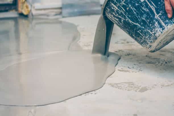
That mistake shows up most clearly in floor coatings.
Homeowners and facility managers see a trending swatch online and assume it will translate cleanly to a coated concrete floor. It usually doesn’t. Floors are unforgiving. They reveal every flaw, every scuff, every poor color decision.
The hype around the Pantone 2026 Color of the Year, Cloud Dancer (#F0EFEB), is a perfect example. On paper, it’s calm and minimal. On floors, especially in active spaces, it can feel flat, dirty, and visually tired far sooner than expected.
Color trends can work—but only when you understand how floors behave differently than walls.
Why Floor Coatings Expose Color Trends Faster Than Walls
Walls are passive. Floors are abused.
Every floor coating we install at Select Coatings has to deal with foot traffic, rolling loads, cleaning chemicals, UV exposure, and abrasion. When people blindly follow color trends meant for editorial photography, floors are where those choices fail first.
In real-world conditions, trendy colors amplify:
-
Dirt visibility
-
Scuff contrast
-
Uneven wear patterns
-
Lighting inconsistencies
That’s why floor coating color trends demand restraint and technical understanding—not enthusiasm alone.
Lesson One: Trend Forecasts Don’t Account for Wear
Organizations like Pantone forecast color trends 18–24 months in advance. These forecasts shape retail, design blogs, and product launches. What they don’t account for is how those colors perform under constant friction.
Even the widely discussed 2026 Color of the Year was never evaluated for abrasion resistance, maintenance frequency, or slip visibility. That evaluation happens on the jobsite—not in a color lab.
When trend-driven colors hit floors, reality hits back.
Cloud Dancer: Why This Off-White Struggles on Floors

Cloud Dancer (#F0EFEB) sits squarely inside current off-white paint trends 2026. It’s marketed as neutral, flexible, and calming.
On floors, it’s none of those things.
In practice, Cloud Dancer:
-
Shows dust within hours
-
Highlights micro-scratches
-
Shifts undertone under artificial lighting
-
Feels visually unfinished in large areas
We’ve seen strong Cloud Dancer paint color reaction from clients who expected “clean minimal” and got “constantly dirty.”
As a wall color, it can work. As a floor coating? Only in very low-traffic, highly controlled environments—and even then, with hesitation.
Transformative Teal: When Bold Color Trends Almost Work

Transformative Teal (#23545B) represents the opposite end of current color trends. It’s deep, confident, and emotionally engaging.
From a coating standpoint, darker pigments often hide wear better. But bold floor coating color trends like this come with another risk: visual dominance.
On floors, Transformative Teal can:
-
Shrink perceived room size
-
Overpower architectural elements
-
Fatigue the eye over time
We recommend this color only in defined zones—entries, feature walkways, or bordered sections—not full-floor saturation.
Bold doesn’t mean careless. It means controlled.
Why Most Paint Color Trends That Fail Were Never Tested Properly
One of the biggest mistakes we see is skipping real-world testing.
People look at a swatch. Or worse, a phone screen. Then they commit thousands of square feet of floor coating based on that image.
That’s one of the most damaging commercial coating mistakes we correct every year.
Lighting alone can destroy a trendy color. North-facing rooms mute warmth. LEDs exaggerate cool undertones. Polished concrete reflects pigment differently than epoxy.
If you don’t test under real conditions, you’re gambling.
Floor Coatings Demand a Different Color Strategy
When clients in Olathe, KS ask us about color trends, we always bring the conversation back to function first.
Floor coatings aren’t décor. They’re systems.
A successful system balances:
-
Pigment density
-
Texture
-
Slip resistance
-
Maintenance tolerance
Trend colors must serve those factors—not fight them.
That’s why our interior floor coatings process always starts with use-case analysis before color selection.
Why Color Trends Age Faster on Floors Than Anywhere Else
Walls can be repainted easily. Floors cannot.
Once a floor coating is installed, you’re married to that color. When color trends shift—and they always do—floors feel dated faster than any other surface.
We’ve watched homeowners abandon spaces because a once-trendy floor color became visually exhausting. That’s not a coating failure. That’s a planning failure.
If longevity matters, trend colors should support the design—not lead it.
How to Use Color Trends Without Regret
After years in the field, here’s what actually works:
-
Use trend colors as accents, not foundations
-
Keep primary floor fields neutral and forgiving
-
Introduce bold tones through borders or zones
-
Prioritize long-lasting paint colors over hype
-
Evaluate maintenance costs honestly
This approach respects color trends without letting them dictate the entire space.
The Emotional Side of Trend Failure
Color isn’t just visual. It’s psychological.
Minimalist off-whites like Cloud Dancer can start to feel cold or sterile over time. Dark bold tones can feel oppressive if overused.
Design mistakes with trending colors usually come from ignoring emotional longevity. A color that excites today can exhaust tomorrow.
That’s why following paint color trends blindly is rarely a winning strategy—especially for floors.
Professional Perspective: What We Tell Every Client
At Select Coatings, our professional painter color advice is always the same:
Trends are tools, not rules.
If a color doesn’t serve the space, the traffic, and the user experience, it doesn’t belong on the floor—no matter how popular it is online.
Color Trends Should Support the Floor, Not Compete With It
Color trends aren’t the enemy. Misuse is.
When applied with restraint, tested properly, and paired with durable systems, trending colors can enhance a space. But when applied blindly—especially on floors—they fail fast and cost real money to fix.
If you want floors that still look intentional five, ten, or fifteen years from now, let performance lead and let trends follow.
That’s how you avoid regret.